Mets Try to Make the Case for Lowercase
The team’s social media messaging has taken an odd typographic turn this season.

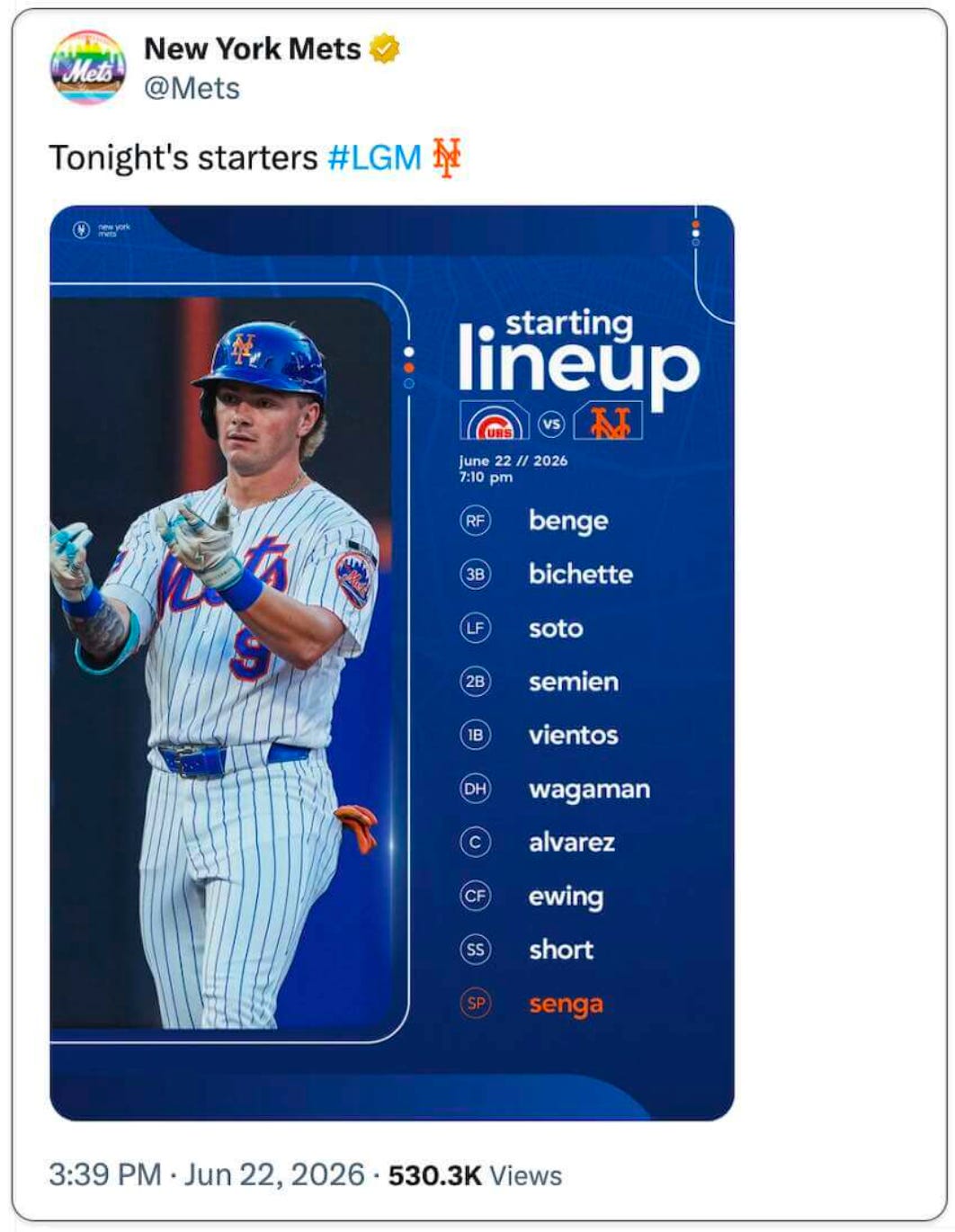
I almost never look at Twitter these days. About the only exception is that I’ll check the Mets’ Twitter feed if there’s inclement weather on gameday, because they’re pretty good about saying if a game has been postponed or delayed. That’s what I did yesterday afternoon around 4:30pm, because the forecast here in New York called for evening thunderstorms, so I wanted to see if the Mets’ home game against the Cubs had been called off. As it turned out, there was no mention of the weather. Instead, the most recent tweet at the top of the feed showed the Mets’ starting lineup for the game (as shown above).
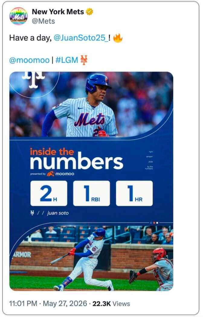
For some reason, I was struck by the all-lowercase lettering. Was that a new thing, or had they been doing it for a while and I just didn’t realize? I scrolled down a bit and soon found this:
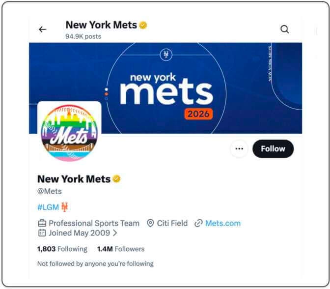
Then I realized that even the header image on the Mets’ feed featured lowercase lettering:
Was this an MLB-wide thing? Nope — I checked a few other teams’ Twitter feeds and saw the usual mix of all-caps and title case. So I went back to the Mets’ feed and quickly discovered that their graphics have been using all-lowercase (at least for the display type, and sometimes for the body type as well) for birthday announcements, holiday celebrations, roster updates, and just about everything else. Check this out (you can click on the images to see the full, uncropped versions):


I checked with Mets Police blogger Shannon Shark, who confirmed that the Great Lowercasing began at the start of this season. It’s not clear to me if the Mets are also using this typographic protocol in other parts of their visual program, like on scoreboard graphics. (Anyone..?)
I have nothing against all-lowercase typography per se. It was originally pioneered by the Bauhaus and later became popular in various forms of midcentury advertising, graphic design, package design, and branding, much of which I like quite a bit. It’s also come up here and there in sports uni and logo design — here are a few examples:


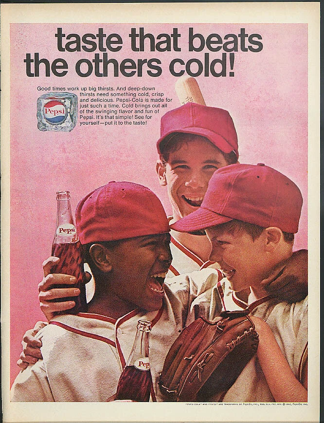



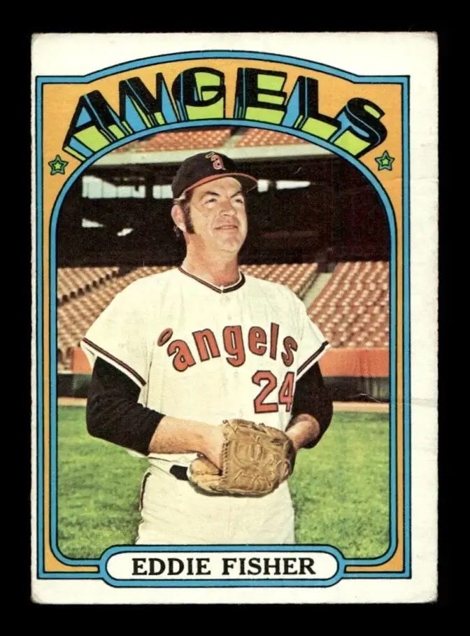
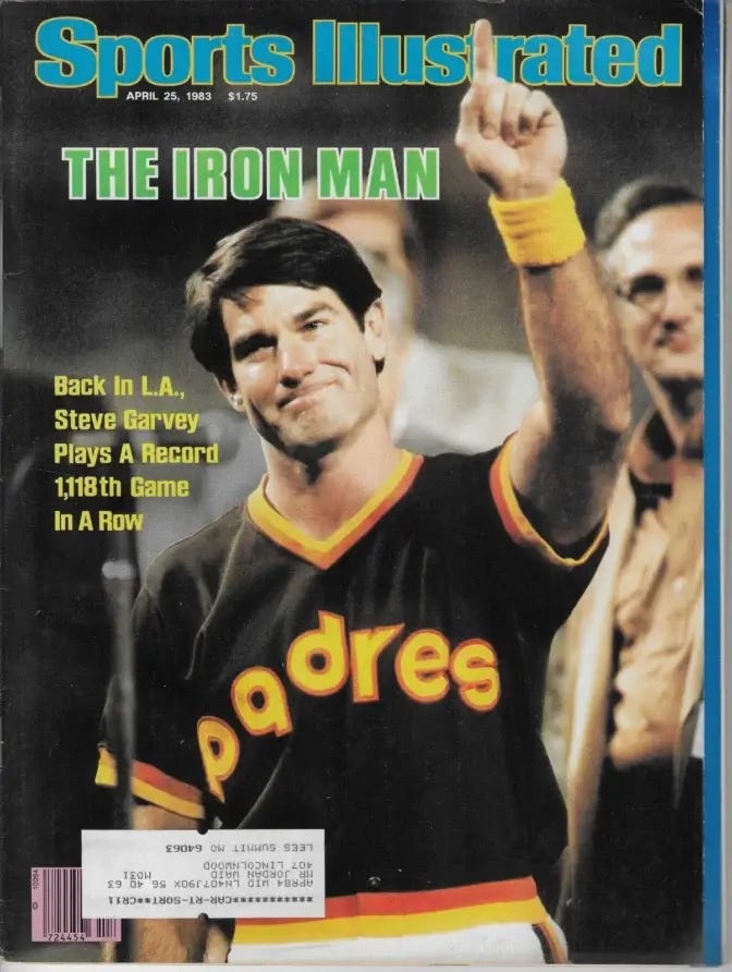
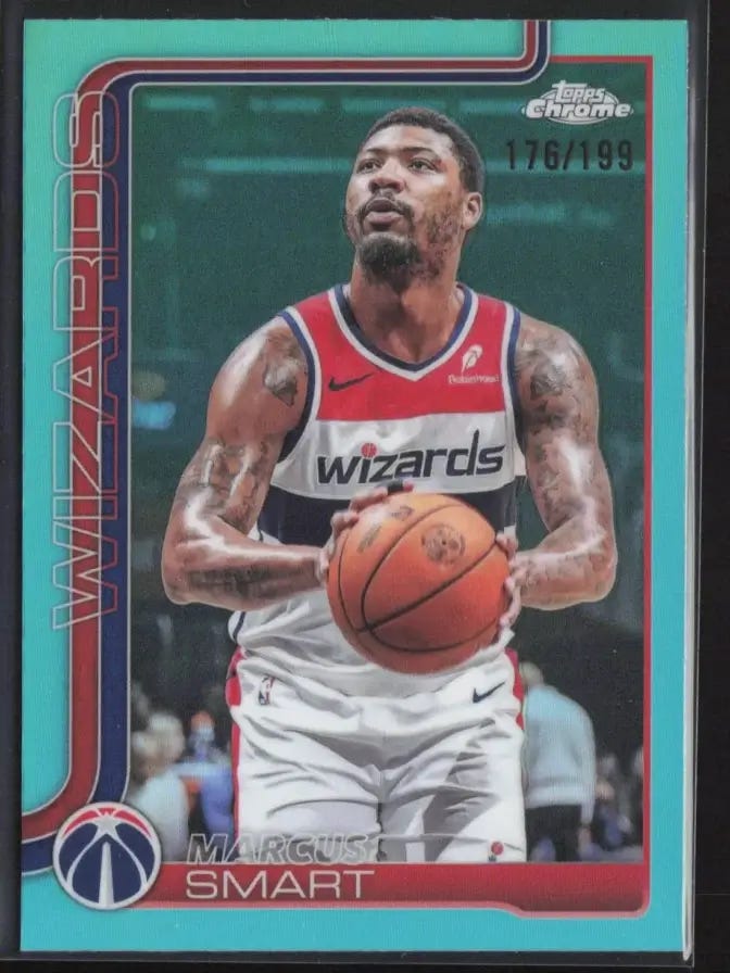
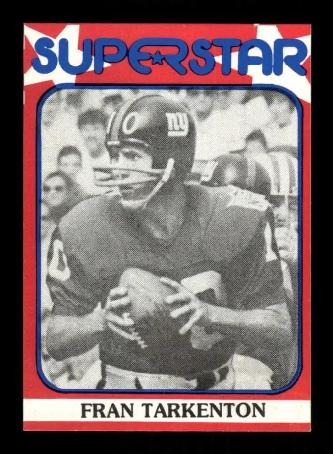
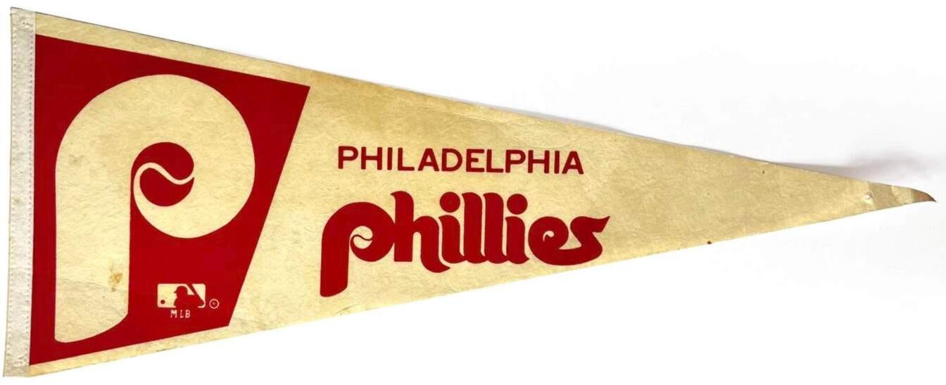
Other practitioners of athletics aesthetics also got into the act, such as when the Topps 1971 baseball card set had the player names and positions styled in all-lowercase:
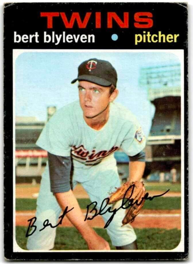
So I guess you could say that there’s some sports-related precedent for what the Mets are doing on their Twitter feed. Plus I realize that many people have stopped bothering to use capital letters in their text messages and emails, so I guess you could also say that the Mets are just mirroring what’s going on in other parts of the culture. Plus-plus the Mets had an MLB-record three players with lowercase letters in their NOBs back in 2014, so I guess you could also-also say that if any team is gonna go this route with their social media messaging, it should be them. And I have to admit that some of those tweets are very nice from a visual composition standpoint.
But still. Seeing all of those names in the starting lineup rendered in all-lowercase looks silly, and seeing the team’s name styled that way makes me itchy. It’s the kind of thing that might seem endearingly eccentric if a good team did it, or maybe a small-market underdog team. But the Mets play in the biggest market, have the second-highest payroll, and are in last place, so cutesy typographic maneuvers seem tone-deaf.
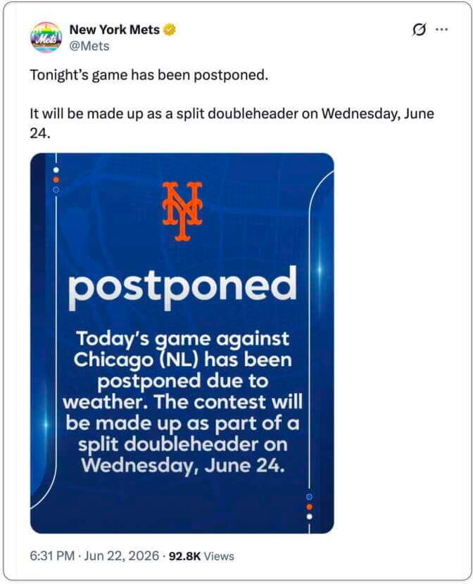
Meanwhile, last night’s game ended up being rained out after all, at which point the Mets’ Twitter feed provided the perfect punchline for this post:
———
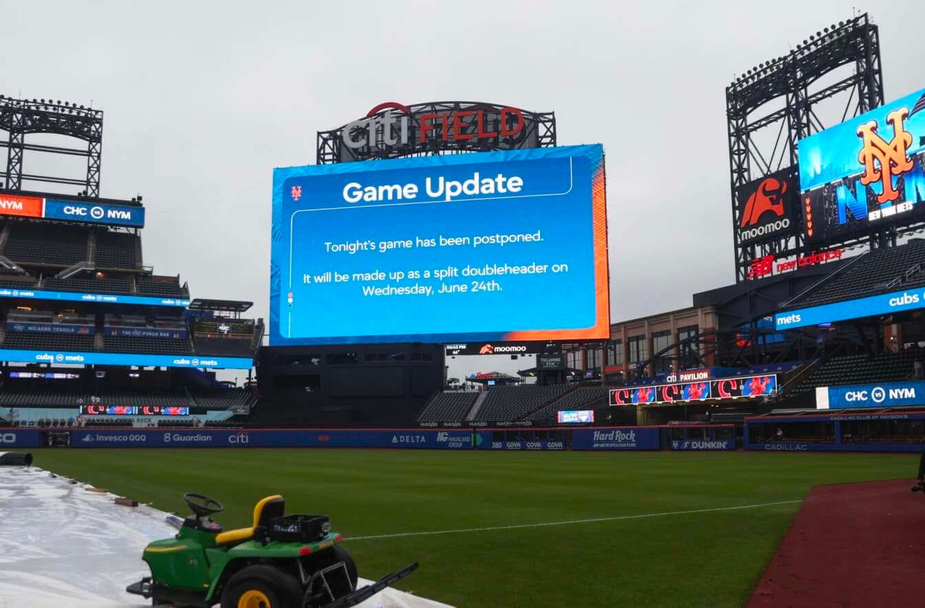
Update: When the rainout was announced last night on the scoreboard at the Mets’ ballpark, the words “Game Update” were in title case, not all-lowercase. But note the lowercase team names on the ribbon board at right: